
RED OXYGEN - CORPORATE ILLUSTRATIONS
Red Oxygen is a mobile gaming and app development company that specialises in second screen development.
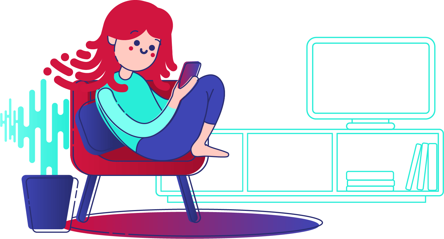
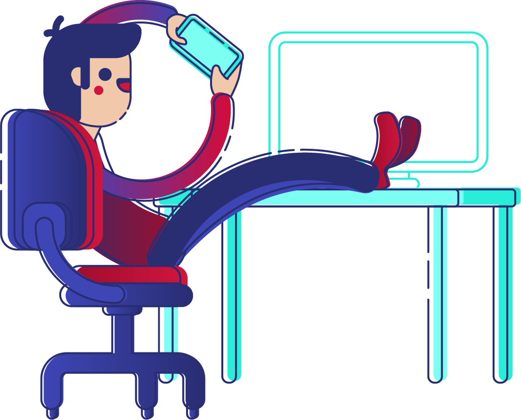
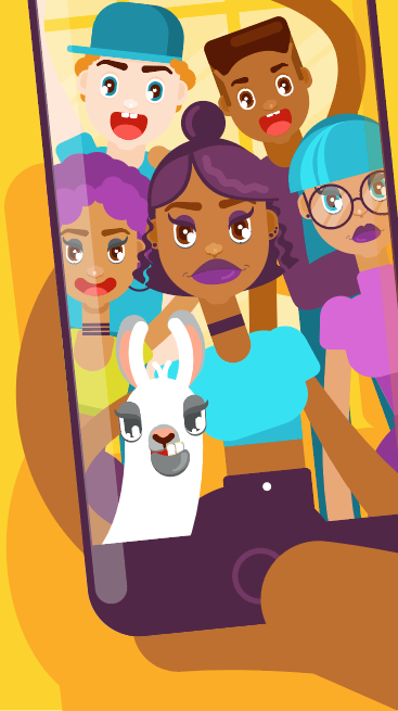
These illustrations were created to be used in one of their pitch documents, to illustrate chapter headings. The topics were in-game currency and rewards eco-sytems, mobile gaming and second screen as it relates to television.
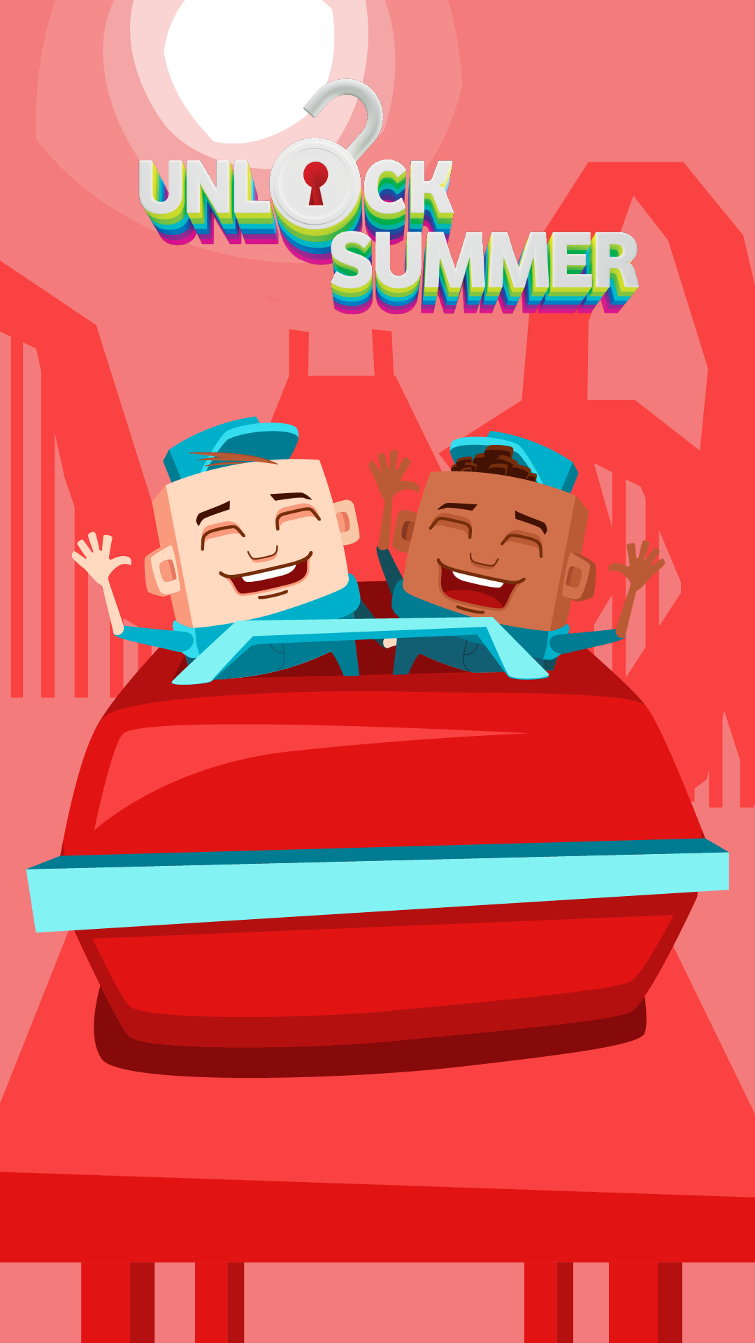
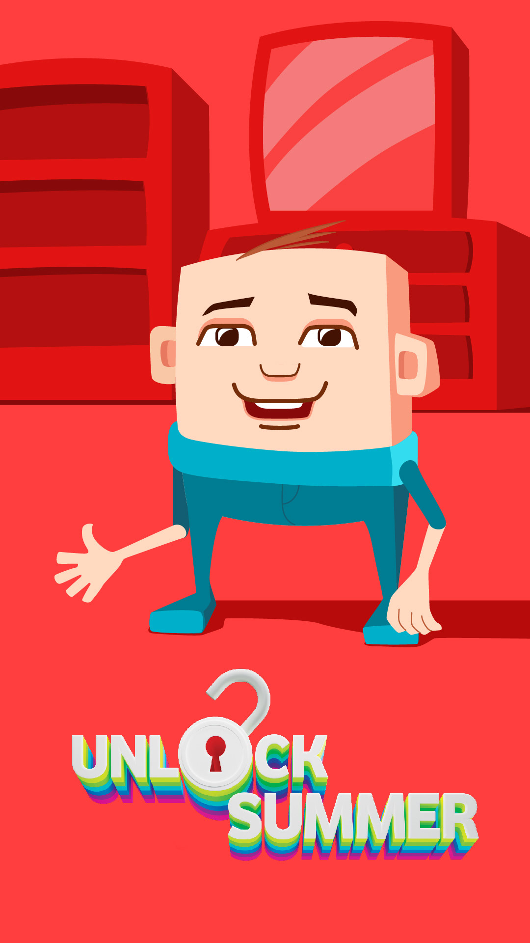
VODACOM SUMMER GAMES NEW STYLE PITCH
When Vodacom wanted to refresh the style of their summer themed mobile games, we pitched a few different illustration styles that were still 2D vectors, but a little newer and fresher.
This style would keep the noodly-arms, but change the figures to the popular “small head, big body” style of corporate illustration. The backgrounds would also be much simpler and use only linework and pattern. The idea was to keep the colour palette mostly Vodacom red, with a few accent colours from their CI.

The style below would be a much bigger departure, with blocky 3D shapes being created out of flat vectors and the use of characters that were a lot less realistic:
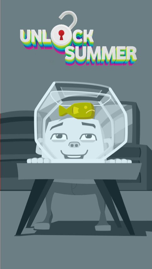
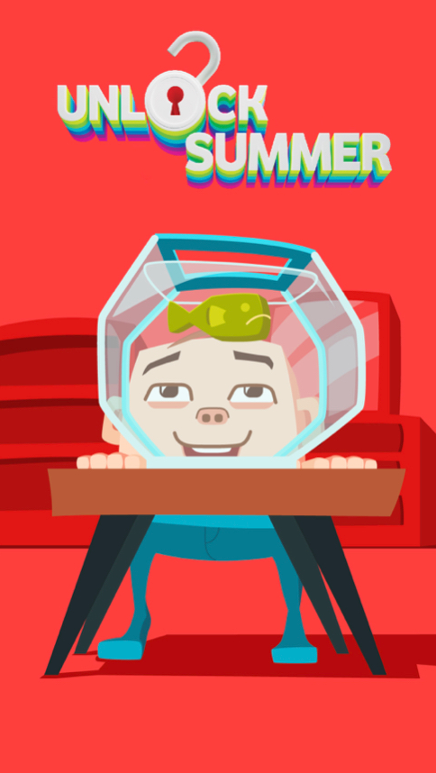
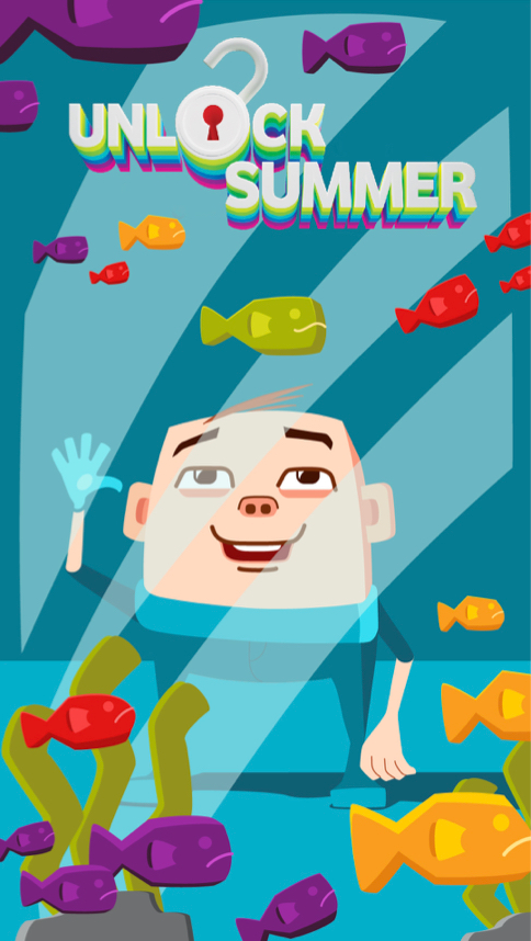
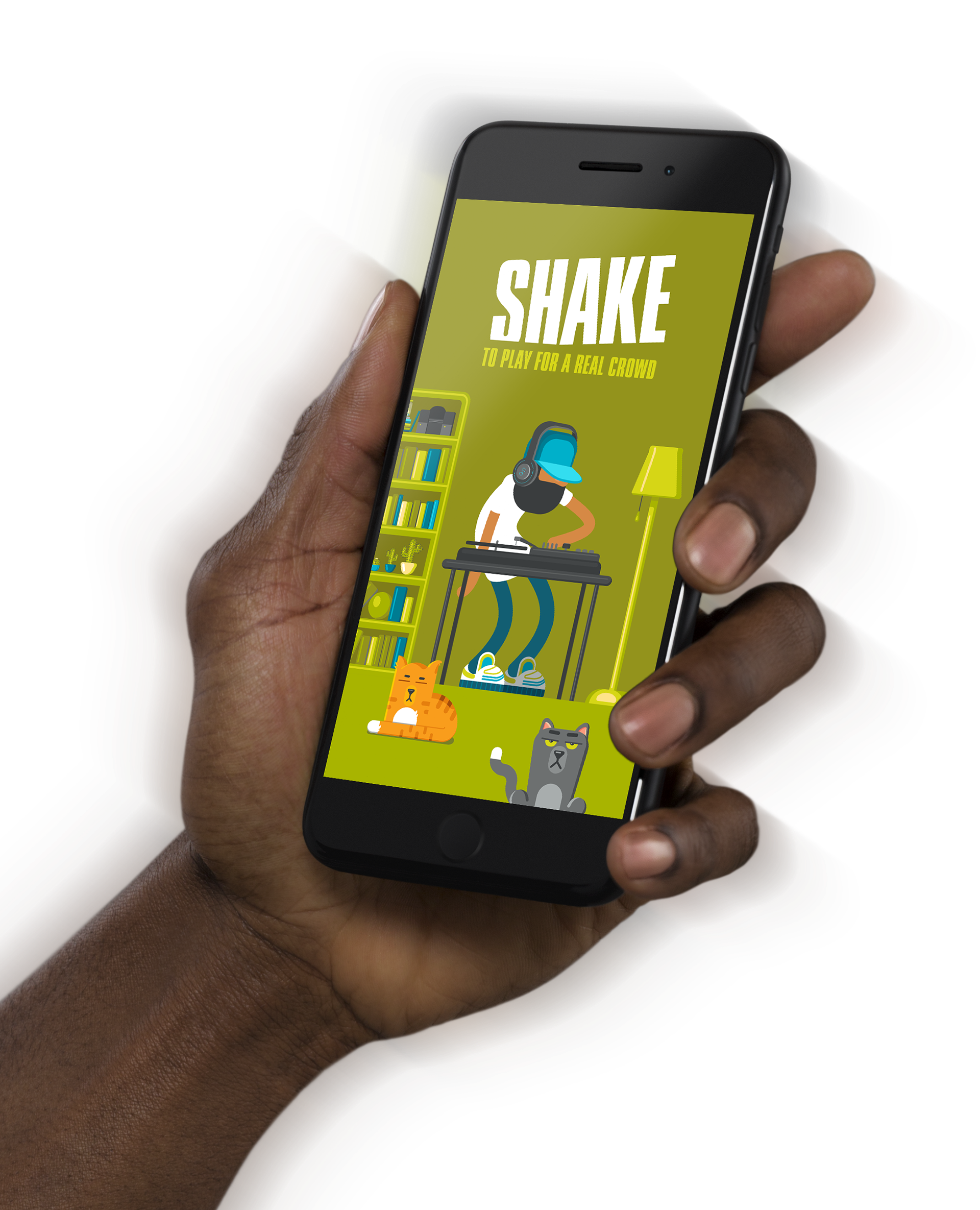
Vodacom shake games
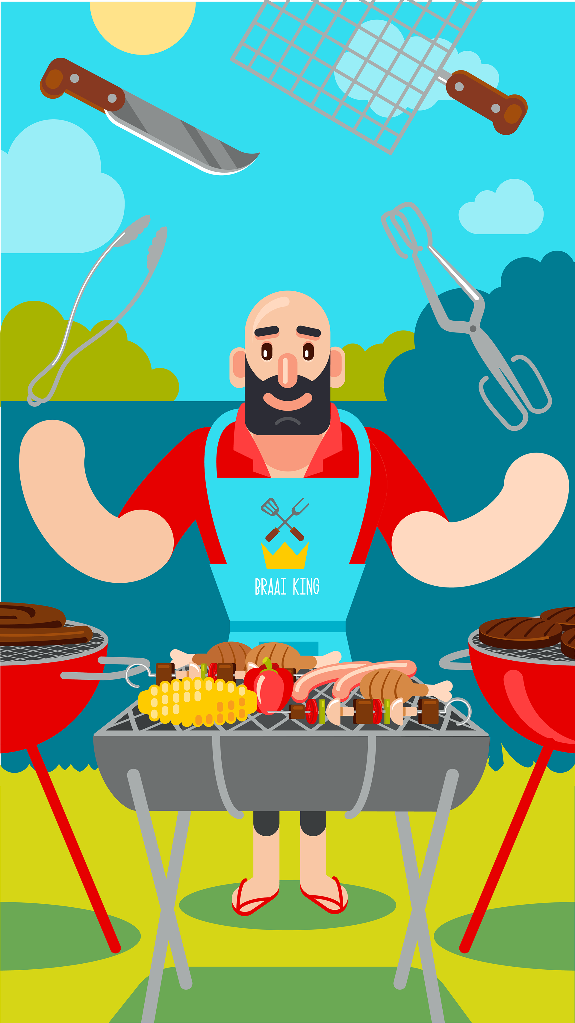
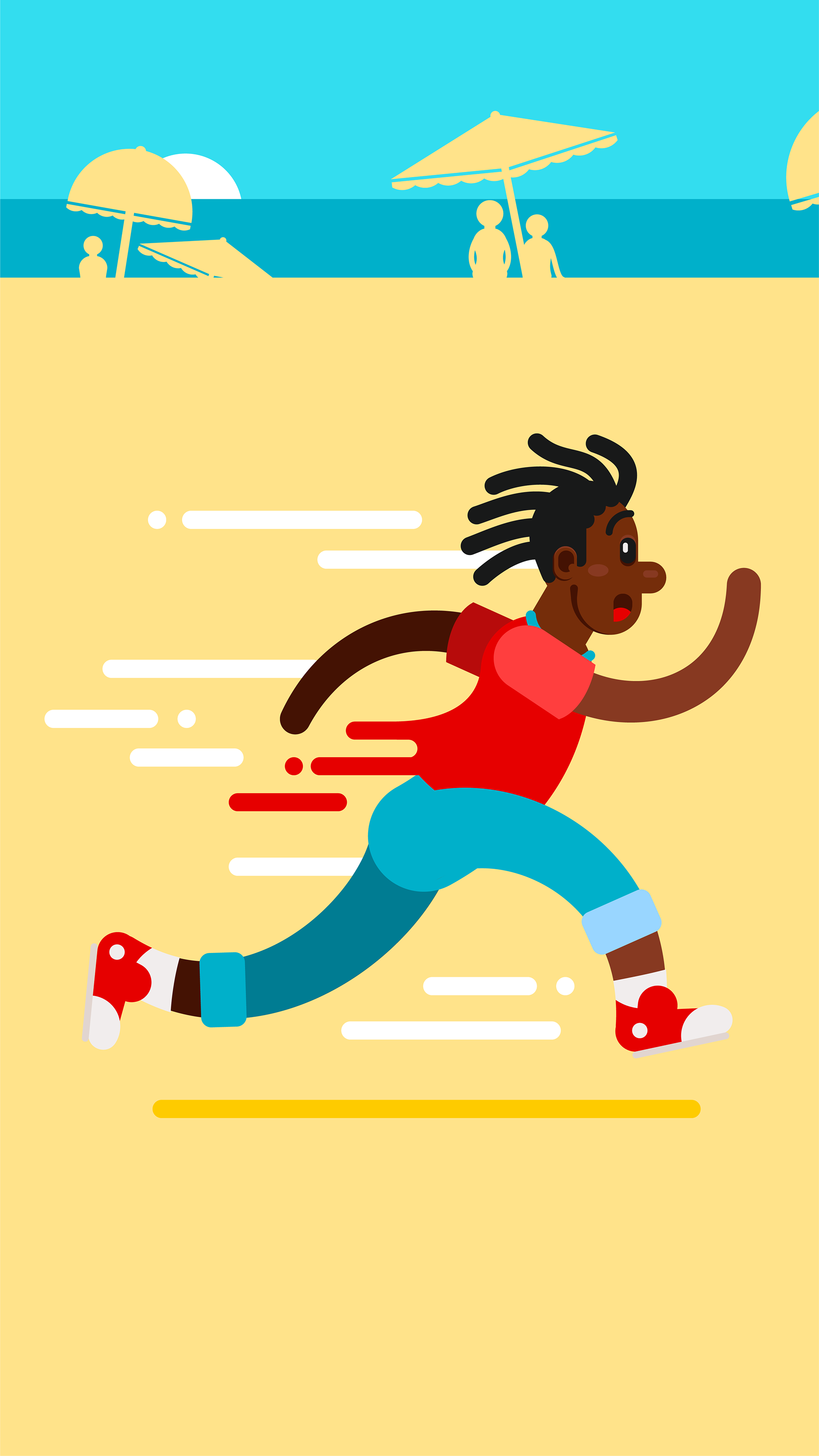
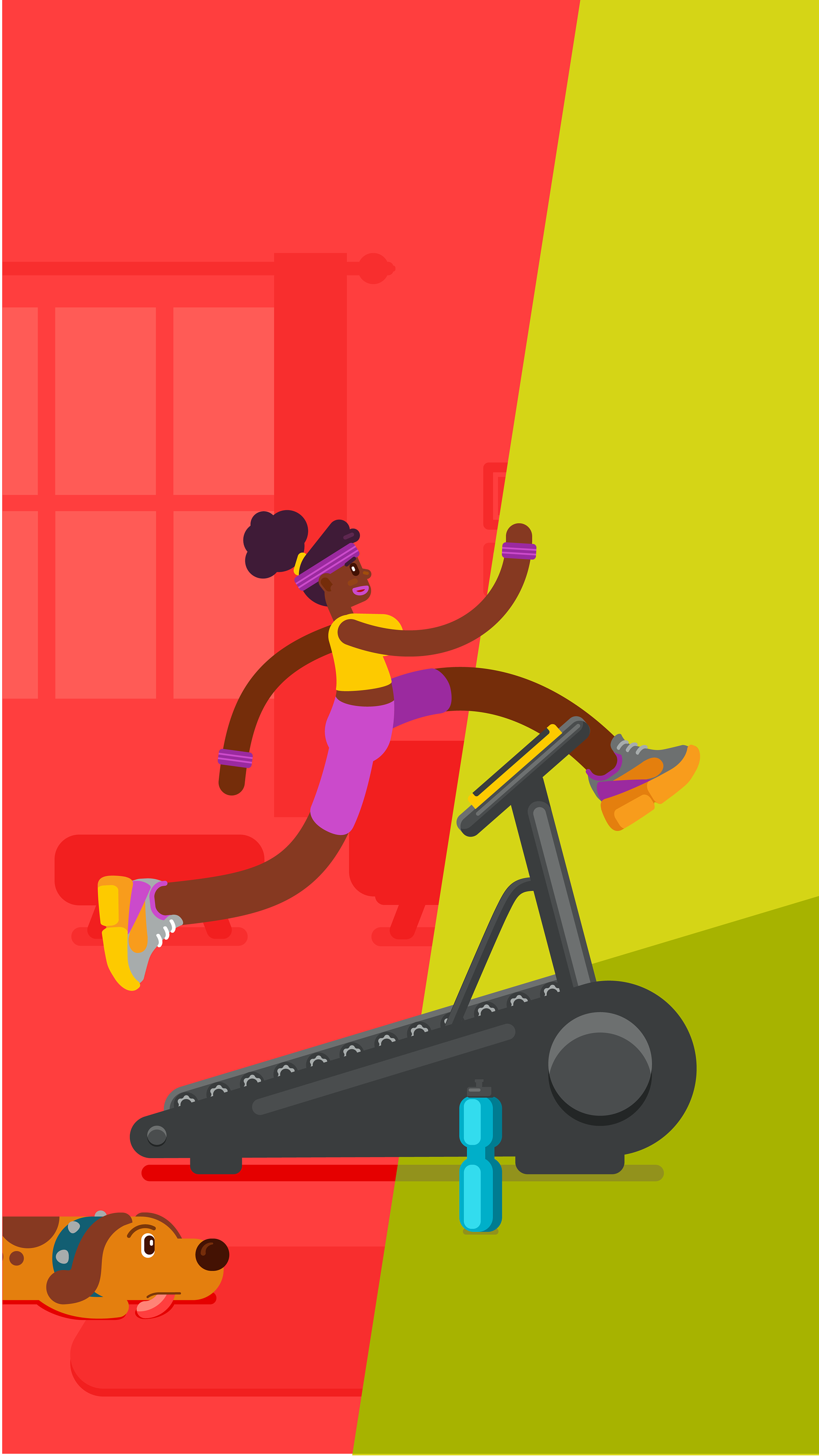
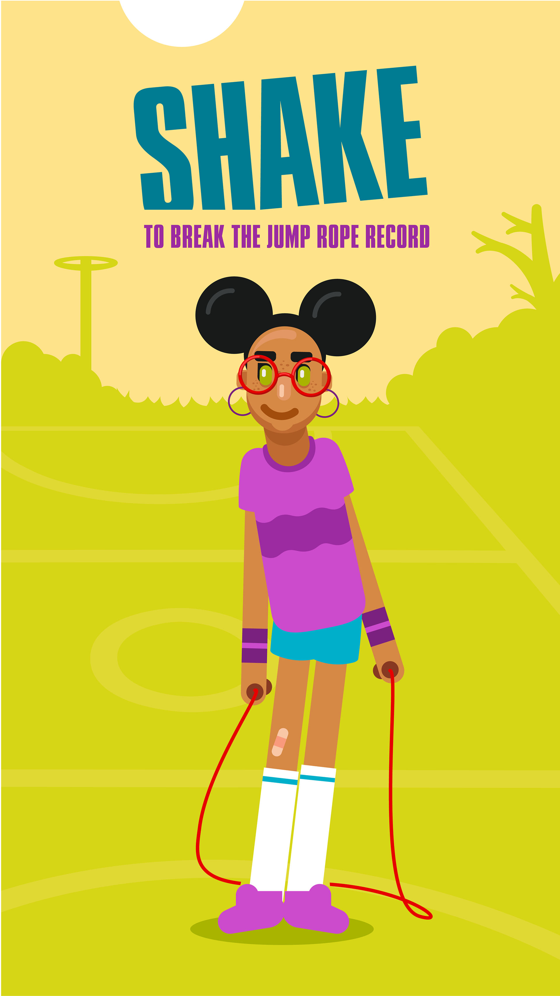
Vodacom Shake Up 2019 & Shake off 2020 were summer promotions run by Vodacom. Using one free “Shake” of your smartphone per day, you could play via USSD, WhatsApp and the My Vodacom App to stand a chance of winning a prize.
The game is simple: Stage 1 shows a character waiting for you to start shaking your phone and a message that tells you what you will achieve when shaking. Stage 2 is where you shake, which triggers a second, “shake” animation. If you shake for long enough (4 seconds) you will unlock stage 3, where the final, success, animation plays.
We at Red Oxygen were given one sentence story descriptions and were tasked with storyboarding full storylines for each video set of three, creating the 2D graphics and animating the videos. My role was to storyboard (first rough pencil sketches and then detailed boards using the finished art) and to create the vector artwork and have it ready for animation.
Creative direction in 2019 by Duncan Bell.


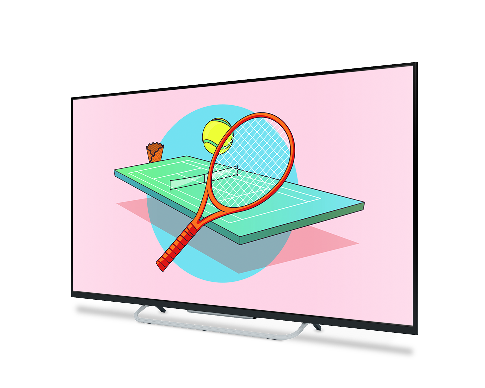
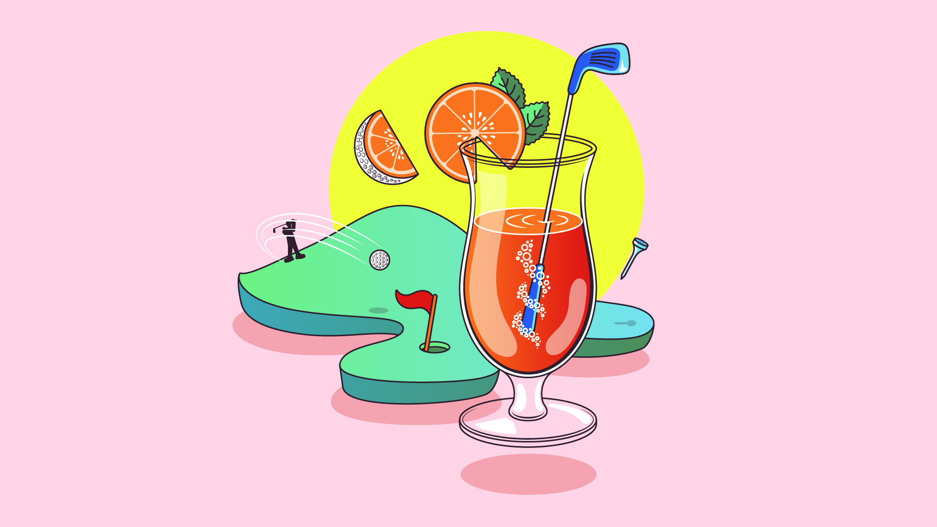
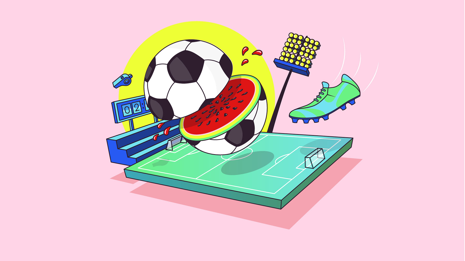
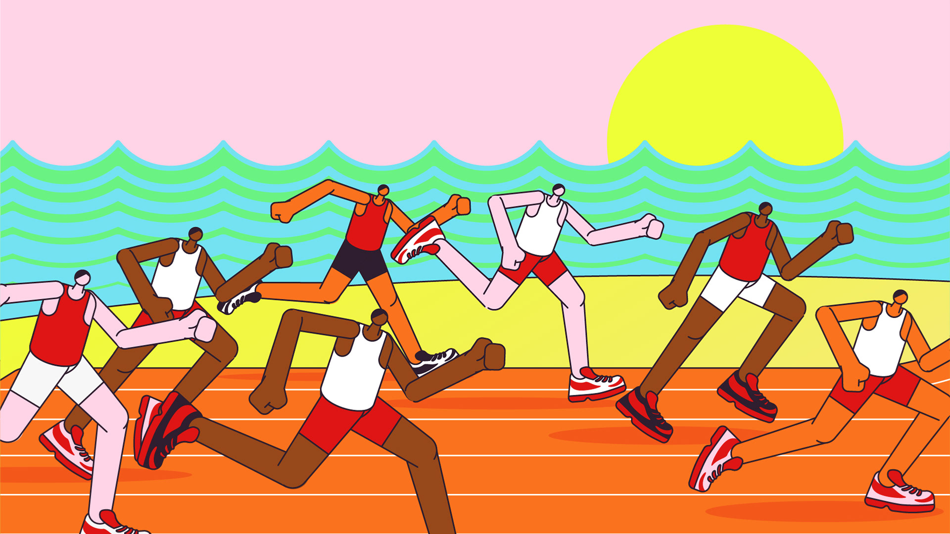
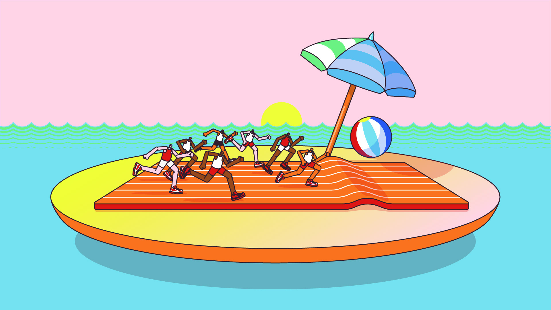
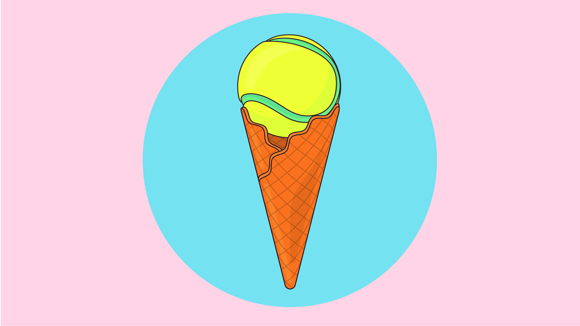
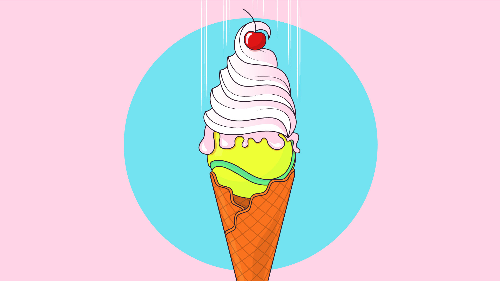
Virgin TV - British Summer of sport promo
Virgin TV needed to promote all the sporting events happenning this summer on their platform. We couldn’t use any footage for the promo, so I got to do a fully illustrated piece. The brief was to create little scenes for each sport (golf, soccer, tennis, athletics and F1) where summer and sport are combined. We went for a visual pun approach, where you think you’re seeing one thing, but it’s really something else. What seems to be a soccer ball is really a watermelon. We went for the more summery colours in the Virgin TV colour palette, with Virgin red used as an accent colour.
Creative direction from Ellen Heydenrych and Marleux Feyt.